RIVERS OF GLORY Named Design of the Year in the 2025 Rome Design Awards for Architectural Innovation
August 19, 2025
Surviving the Storm and Shadows of Still Wakes the Deep
August 20, 2025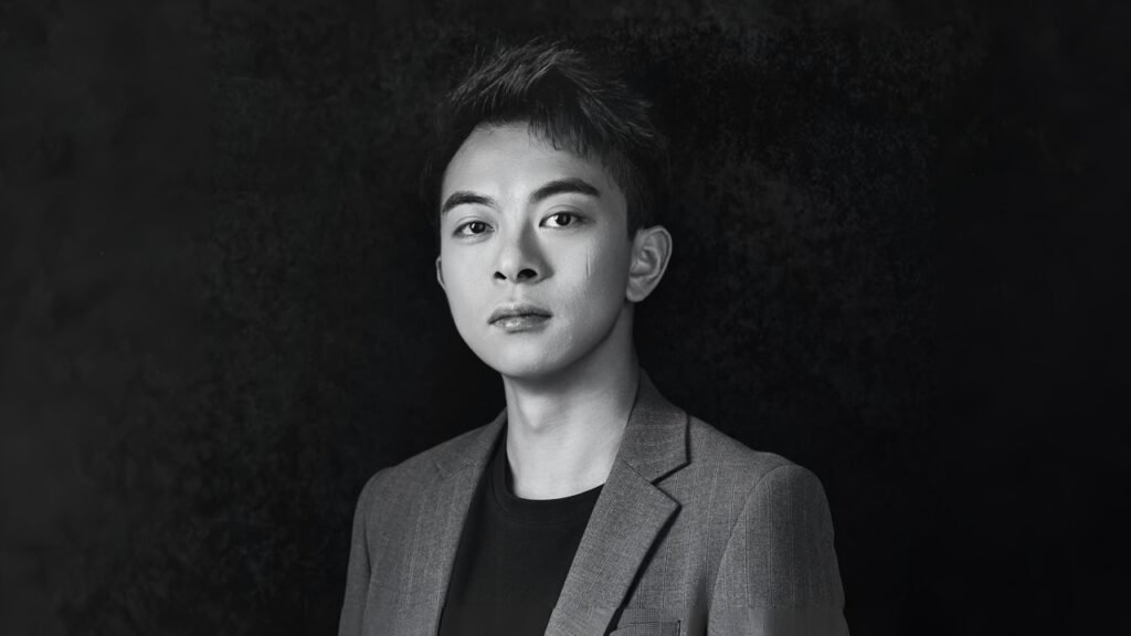
Thank you for your congratulations! I have been looking forward to the French Design Awards for a long time, and I am delighted to receive it.
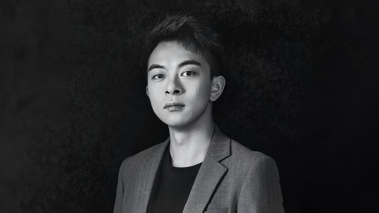
My name is Sinong Wu, and I’m a packaging designer with over ten years of experience. I run my own company, where I also serve as the design director. In China, we’ve had the privilege of creating packaging for many renowned brands, including Wuliangye, Fenjiu, and Luzhou Laojiao. I have also won various international design awards.
For me, the charm of design lies in its ability to use visual language to cross cultural and linguistic boundaries and directly touch people's hearts. Design is a symbiotic relationship between solving problems and creating aesthetics.
I have been looking forward to this award for a long time. I am proud to have successfully won two platinum awards through my design works "LUZU.50" and "1529. YLS. Yinpiaolaohao". Winning two platinum awards at the French Design Awards, an important international design competition, is a significant milestone in my career. This honour represents a high recognition in the field of design and also makes me more confident.
The French Design Awards have high evaluation criteria, and the Platinum Award, as a high-level award, means that the work has reached the international top level in terms of conceptual originality, style breakthrough, user experience, and commercial value. This recognition has endowed the work with global quality certification, attracting the attention of partners.
Winning two platinum awards at the French Design Awards is a significant breakthrough for my career and greatly enhances my personal industry influence. I believe it will enable me to obtain more business cooperation.
For the team, this is a great motivation, enhancing cohesion and confidence, and attracting more outstanding talents to join.
Experiments allow me to break through conventional thinking, verify hypotheses, discover unexpected beauty, and ultimately find the most innovative and effective solutions.
Most Baijiu designs use dark colours to reflect the profound cultural attributes of products. In this award-winning design, we experimented with different styles. Boldly explore new boundaries and use bold colours to create visual impact. Use element design creativity to reflect the historical attributes of the product. Undoubtedly, I think I have created a new style for the packaging design of Chinese Baijiu.
All of this starts with the 'experiment' for us. Good 'experiments' may lead to breakthrough designs.
Most Chinese light-flavour Baijiu adopts traditional visual frameworks such as "auspicious clouds, calligraphy strokes, and water drop bottle" to convey the concept of "light-flavour Baijiu".
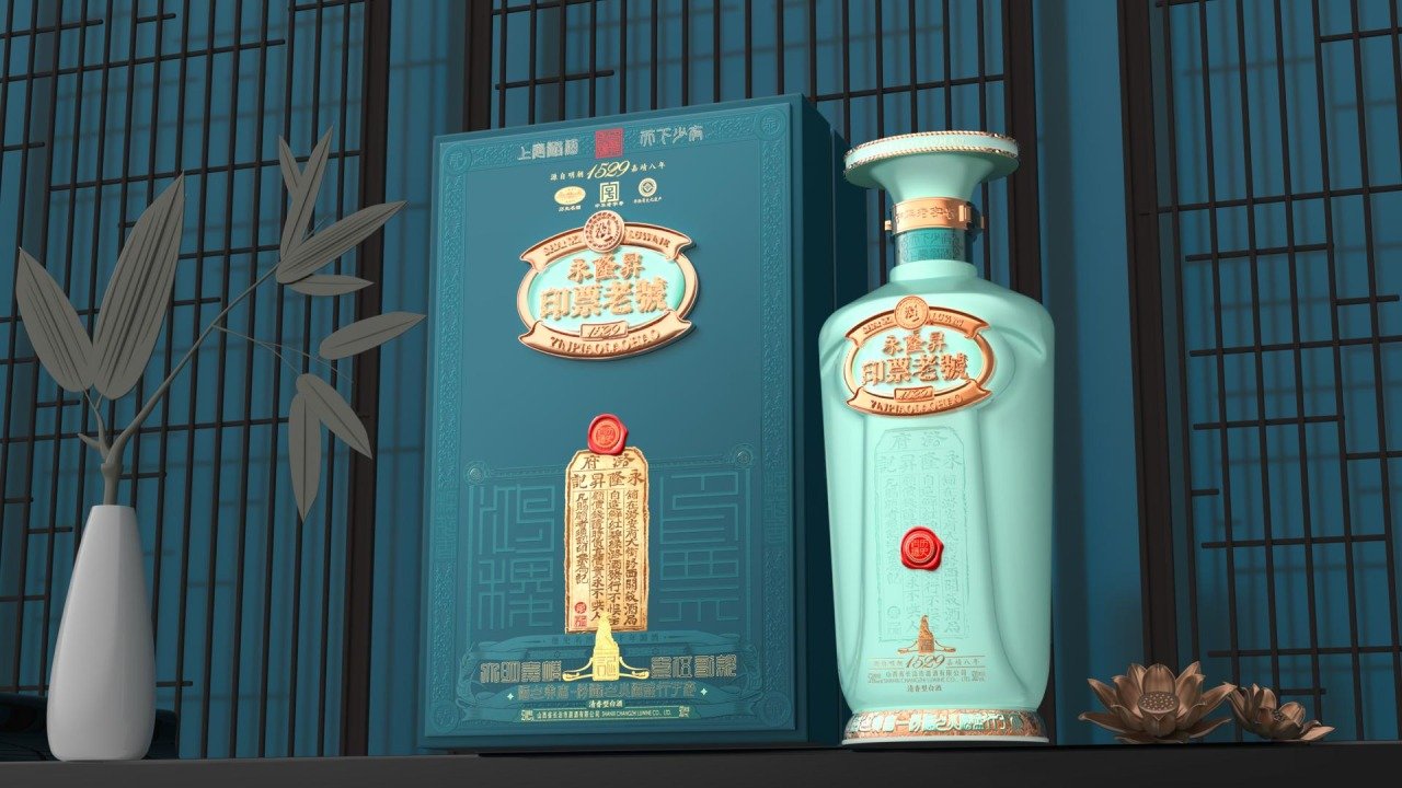
This time, the award-winning project "Yinpiaolaohao" is also a fragrant Chinese Baijiu. Part of the inspiration for bottle design comes from sculpture, which is rarely seen in Chinese Baijiu. I want to create a style by combining the visual elements of sculpture with the unique culture of this brand. Create all of this through the combination of rich culture, colour, and sculptural line language.
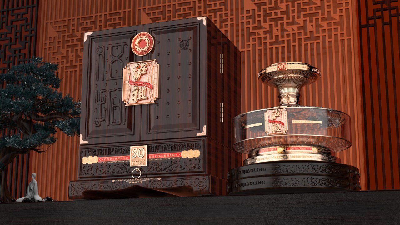
In another project, 'LUZU.50', which is a commemorative wine for the 50th anniversary of the distillery, we catered to traditional culture in our design, but abstractly expressed traditional culture.
In terms of the logo design on the front, the overall design is an ancient Chinese wine back shape, which I combined with an abstract hourglass pattern and red floating to showcase. The hourglass represents time, the red ribbon represents celebration, and 50 years to half a century of heritage and craftsmanship.
What I particularly hope more people understand is that design is not an "instant burst of inspiration," but a "systematic exploration" that interweaves rationality and sensibility. Many people think that the job of a designer is to "wait for inspiration to come," but in actual projects, inspiration often arises from the deep analysis and reconstruction of constraints.
For example, when designing packaging for alcoholic beverages, we need to consider the impact of the bottle structure on the ageing of the liquor, the moisture resistance of the label material, the impact resistance during transportation, and even the comfort of holding the bottle when opening it. These "technical parameters" may seem unrelated to aesthetics, but they can shape the creative direction in reverse.
Understanding this may lead more people to respect the value of design: it is not only a visual presentation but also an art of using systematic thinking to solve complex problems.
Balancing customer expectations and personal creativity in packaging design lies in deeply empathising with customer needs while adding value to the solution from a professional perspective.
Firstly, through multiple rounds of communication, break down the underlying logic of customer expectations - when customers say they want a high-end feel, what they may really need is to increase brand premium through packaging. The demand for 'cost reduction' may essentially be aimed at optimising supply chain efficiency.
After clarifying the core goals, I will focus my personal creativity on addressing these implicit pain points. The secret to balance is not compromise, but to make personal ideas the "optimal solution" for customer goals, ultimately delivering not only packaging but also strategic design that can drive brand growth.
We did encounter some challenges. In Chinese light-flavour Baijiu, the excessive consumption of traditional cultural symbols made the product have no design language.
The award-winning work Yinpiaolaohao Baijiu is a delicate Baijiu. In China, delicate Baijiu mostly uses traditional patterns, such as auspicious cloud patterns and calligraphy strokes, which are many patterns used in delicate Baijiu.
However, similar products in the market have been flooded with symbols such as cloud patterns and ripples, resulting in a lack of recognition in design. I refuse to use these traditional symbols.
I went to the distillery for an on-site inspection, exploring the cultural and regional characteristics of the distillery. In our design, we can clearly feel a new style and the distillery's own culture. We have created our own style for the customer.
In the design of the award-winning work LUZU.50, this is a commemorative wine commemorating the 50th anniversary of the distillery. As a designer, the challenge I need to solve is to make consumers who do not know this brand feel that this Baijiu is of good quality.
We have delved deep into the location of the distillery - China Design products in Luzhou City by understanding the local regional characteristics and combining them with the history of the distillery.
Luzhou, located at 28 degrees north latitude in China, is known as the "Dragon Vein of Brewing Wine". We have also reflected this in our design, highlighting the excellent quality of the wine. Switch to transparent crystal glass bottles, making the colour of the wine (the slight yellow of old wine) the most intuitive proof of quality.
As a designer, I have used design language to address the challenges faced by these two award-winning designs, whether it is the homogenisation of cultural expression or the establishment of user trust. This' problem-oriented elegance 'may be closer to the essence of design than any visual technique.
I will go to see a lot of excellent design works, and if you think a certain style or element is designed beautifully and perfectly. You can provide a reference and analyse the areas where he did well. Then incorporate it into your design.
Developing a habit is to watch and collect more excellent works in the industry. If there are really no good ideas, my suggestion is to take a break and not think about anything. Of course, you can also watch your favourite TV shows and so on. I sometimes draw inspiration from television programs or other traditional cultures.
I am mainly engaged in Baijiu packaging design. The most important thing in Chinese Baijiu's liquor packaging design is liquor culture. Consumers are also willing to pay for the added value of history and culture. I respect this very much because good design is not just about the design itself; it should also have commercial value and create value for customers.
In my two award-winning designs this time, you can clearly see cultural attributes - extremely strong cultural attributes. But their styles are different. Create designs tailored to the winery's own culture based on different regions and cultures. I believe it is what they hope to see and what consumers are willing to accept. It also reflects my value as a designer.
When consumers touch the texture of the bottle, the wine culture, and the regional culture, they perceive not only the fragrance of Baijiu, but also a designer's profound thinking on tradition, aesthetics, and humanity.
For designers who pursue success, my suggestion is to participate more in fair and just awards like the French Design Awards, realise the gap between themselves and other designers in the world, and communicate with outstanding designers internationally.
In addition, with user value as the starting point of design, design is not an art of self-expression, but a tool for solving problems. Build credibility with your work - instead of actively promoting it, make the work itself your business card.
Focusing on completing each project and mastering the entire process from concept to implementation is more important than a stunning idea. Maintain a beginner's mindset, constantly improve your professional depth and cognitive breadth, and time will give you the answer.
If I could collaborate with any designer, I would choose Dieter Rams.
His design philosophy of "less is more" — emphasising that "good design is as little as possible" — aligns closely with my pursuit of "using subtraction to convey cultural depth" in liquor packaging design. His minimalism helps strip away redundant elements and allows traditional symbols (such as minimalist landscapes and seal carving) to reach users in a purer way.
Rams’ designs always prioritise functionality, such as the radio he designed for Braun, which deeply integrates button layout and usage logic. This kind of thinking can solve the pain points of Baijiu packaging: optimising user experience while retaining a sense of cultural ritual.
Rams believed that "good design is enduring," requiring works to withstand the dual tests of time and the market. If we collaborated with Rams, we could further explore how to keep traditional cultural symbols alive in contemporary consumer contexts. The essence is to return to the "essence of design" — using the simplest logic to solve the most complex problems.
What kind of job would you do if you were not a designer?
Actually, I really want to be a racing driver or a stunt pilot, experiencing speed and passion!
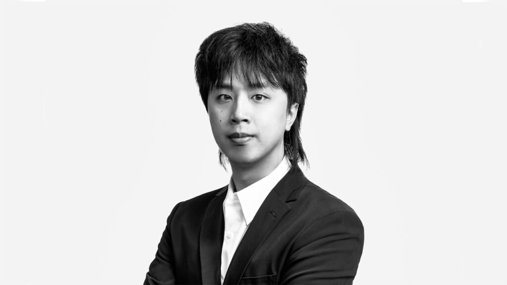
Sinong Wu
A veteran packaging designer and creative leader, Sinong Wu has shaped the brand identities of Wuliangye, Fenjiu, Luzhou Laojiao, and more. His work has earned international recognition for its fusion of visual elegance and technical problem-solving.
Read more interviews in The Intersection of People & Place: Insights from Zehua Zhang here.


