How Nick Ellis is Changing Game Marketing with Theorycraft Marketing
May 7, 2025
2025 Noble Business Awards Announces Elite Winners of Outstanding Achievements and Leadership for Season 1
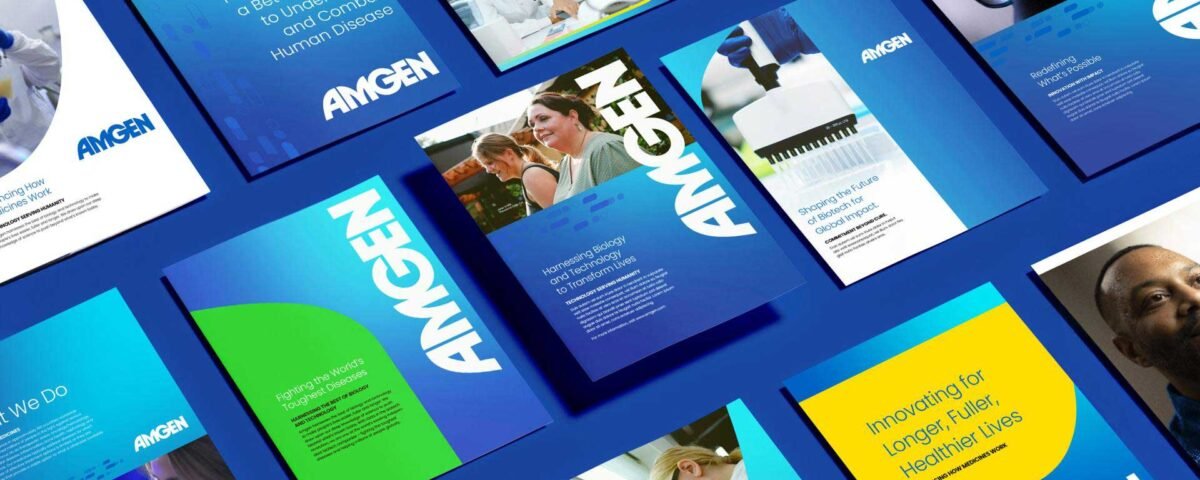
May 9, 2025Awarded Best Healthcare Rebranding, Amgen offers a compelling example of how thoughtful, strategic brand refinement can reinforce decades of trust while signaling a confident step into the future of biotechnology.
In an industry built on trust, clarity, and connection, a healthcare brand’s identity carries significant weight. Yet as the healthcare environment grows more complex—shaped by technological advancements, shifting patient expectations, and increased competition, many organizations are discovering that their existing brand no longer tells the right story. A new look in healthcare often points to something bigger: a renewed vision, a changing mission, or a fresh way of connecting with those who matter most. It allows institutions to realign their values with their public image, strengthen relationships with patients and stakeholders, and position themselves for long-term relevance.
Amgen chose to build on its strengths, updating its brand without losing sight of its roots. With a legacy spanning over four decades at the forefront of biotechnology, it has consistently pushed scientific boundaries while remaining grounded in its mission to improve lives. But as the company expanded globally, it faced a familiar challenge: how to present a unified voice across markets without losing the depth and warmth that define its work. The rebrand wasn’t about chasing trends or dramatic overhauls—it was about clarity, cohesion, and purpose. By refining its visual identity and messaging, Amgen managed to reflect both its cutting-edge science and its deeply human focus, creating a brand that feels as consistent and trustworthy as the care it champions.
To modernize Amgen's brand, The Development led the evolution of its strategy, visual identity, design system, and brand management platform. This transformation encompassed everything from corporate assets to marketing materials, digital channels, and motion/video storytelling, ensuring Amgen's visual language matched its innovative science. Collaborating with PR agency Porter Novelli on corporate reputation, The Development ensured the rebrand reflected both Amgen’s legacy and its bold future. Together, they created a brand presence that reinforced Amgen's leadership in scientific innovation and its impact on patients’ lives, aligning the brand’s story with its mission.
Amgen’s rebrand wisely preserved its iconic logo, anchoring the refresh in recognition and clarity. Rather than creating something entirely new, the team leaned into the existing brand, with the bold wordmark and proprietary Amgen Blue reinforcing expertise, while the flowing lines reflect compassion. Building on this foundation, The Development introduced the A-Shape, a graphic device inspired by the logo, alongside refined typography, a broader color palette, and the Data Stream motif. The Data Stream symbolizes the convergence of biotech and high-tech, showcasing Amgen’s expanding capabilities in AI and data science. This thoughtful evolution strengthens the brand, maintaining its legacy while positioning it for the future.
By refining its identity rather than overhauling it, Amgen shows that thoughtful evolution can strengthen a brand without losing its core values. This approach not only positions Amgen as a leader in biotech but also offers a valuable lesson for the healthcare industry: change can be meaningful and strategic, without being disruptive. For the branding world, it highlights the importance of continuity and relevance, proving that even established brands can modernize without losing their identity. In the end, Amgen’s rebrand strengthens its connection with both patients and the wider industry, setting a new standard for how healthcare brands can evolve with purpose.
At the intersection of storytelling and design, ORYX/OpSec creates brand identities that are both authentic and impactful. Discover their approach and see what sets them apart.


