
Building Tomorrow’s Taoyuan – Explains Mayor Chang San-cheng
July 22, 2025
Three Voices, One Vision: Three Designers Builds with Purpose
July 22, 2025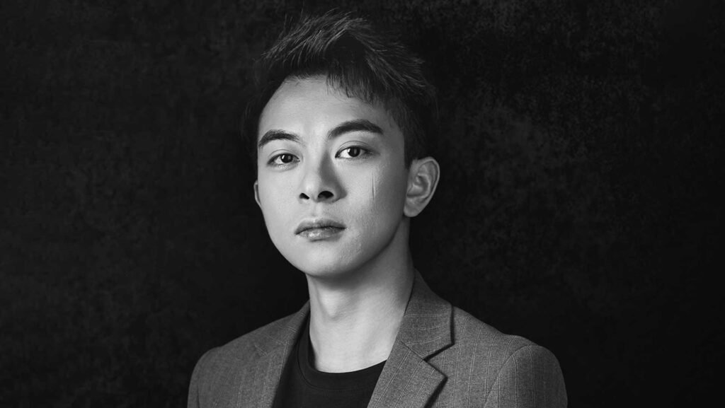

Sinong Wu
With over ten years of experience, Sinong Wu is a packaging designer and design director who leads his own company. While specializing in liquor packaging, his team also creates designs for food and tea products. In China, he has had the privilege of working with renowned brands such as Wuliangye, Fenjiu, and Luzhou Laojiao.
Thank you for your congratulations!
My name is Sinong Wu, and I’m a packaging designer with over ten years of experience. I run my own company, where I also serve as the design director. While we specialize in liquor packaging, we also work on designs for food and tea products. In China, we’ve had the privilege of creating packaging for many renowned brands, including Wuliangye, Fenjiu, and Luzhou Laojiao.
For me, the charm of design lies in its ability to use visual language to cross cultural and linguistic boundaries and directly touch people's hearts. Design is a symbiotic relationship between solving problems and creating aesthetics.
'Improving Life with Creativity' drives me to constantly explore the boundaries of packaging design—whether it's conveying environmental concepts through sustainable materials or enhancing user emotional connections with classical luxury designs.
The recognition of the MUSE Design Awards is a testament to the original intention of this design, and it also strengthens my belief that good design should be like a silent mentor, subtly guiding people to discover the poetry in their daily lives.
The recognition of the MUSE Design Award is a significant affirmation and motivation for me. It is like a bright light, illuminating my path of continuous exploration in the field of packaging design.
From a professional perspective, this award program holds a high reputation in the international design industry. Receiving this honor is a strong recognition of my professional abilities, innovative thinking, and attention to detail. It proves that the effort and dedication we have invested in packaging design, as well as the creative ideas we have developed day and night, have reached an international top level, which makes me proud.
At the same time, this is also a great responsibility. It inspires us to continually push our limits and explore the infinite possibilities of packaging in future designs.
Winning the MUSE Design Awards has had a profound and positive impact on both my career and the institution I work for, bringing many valuable opportunities.
For me personally, it has greatly enhanced my industry visibility and influence. It has given me more opportunities to participate in international cutting-edge design exchange activities, broaden my design horizons, gain new inspirations and concepts, promote continuous growth and breakthroughs, and reach new heights in my career.
For the institution, this award has become a shining symbol, enhancing its reputation and competitiveness within the industry.
Experiments allow me to break through conventional thinking, verify hypotheses, discover unexpected beauty, and ultimately find the most innovative and effective solutions.
When designing biodegradable packaging for an environmental brand, the traditional approach was to use a single environmentally friendly material. However, testing showed that its strength and waterproofing were insufficient to meet product requirements.
So, we launched a series of material experiments: mixing sugarcane bagasse and bamboo fiber in different proportions with biodegradable bioplastics, making samples through 3D printing, and simulating transportation environments with pressure, humidity, and drop tests.
During the process, an unexpected discovery changed the design direction—when the proportion of sugarcane bagasse reached 40%, a rough texture similar to wood grain naturally formed on the surface of the material. This not only enhanced friction (reducing transportation slippage) but also perfectly matched the brand's concept of "natural symbiosis."
This project made me deeply realize that experimentation is not only a process of technical validation but also a catalyst for creativity. It forces you to break free from the preconceptions of "what should be done" and instead focus on "what could happen," in order to find a balance between functionality, aesthetics, and sustainability in design.
The two project designs that won the MUSE Design Awards this time are as follows. The first product is named "WAIZUI," which means "crooked mouth" in Chinese. Its overall design inspiration comes from the "S" shape of a flowing river.
The second product is "Yinpiaolaohao," which means "poster." The design inspiration for this product comes from what may be the earliest poster in China, which states the address of the distillery and the alcoholic beverages sold. After many years in the industry, this is the first time I have used a poster as the brand name for a product.
What I particularly hope more people understand is that design is not an "instant burst of inspiration," but a "systematic exploration" that interweaves rationality and sensibility. Many people think that the job of a designer is to "wait for inspiration to come," but in actual projects, inspiration often arises from the deep analysis and reconstruction of constraints.
For example, when designing packaging for alcoholic beverages, we need to consider the impact of the bottle structure on the aging of the liquor, the moisture resistance of the label material, the impact resistance during transportation, and even the comfort of holding the bottle when opening it. These "technical parameters" may seem unrelated to aesthetics, but they can shape the creative direction in reverse.
Understanding this may lead more people to respect the value of design: it is not only a visual presentation but also an art of using systematic thinking to solve complex problems.
In the early stages, I conduct in-depth interviews to transform customers' vague "wants" into verifiable "needs." For example, if a customer says they want a "high-end feel," I ask whether it is for the gift market or to increase brand premium, aiming to find the real demand. In the design process, I use data and experiments to support creativity rather than simply emphasizing "aesthetics."
If the client questions the plan, I present the results of user research, competitor analysis, or material testing to shift the decision from a "subjective preference" to a "rational choice."
This balance is not a compromise, but rather, through communication and collaboration, by making the client a co-creator of the design, the final product carries both my professional judgment and meets the client's business goals.
I won two awards this time: a Platinum and a Gold!
The product "WAIZUI," which won the Gold Award, is widely known in Southwest China. This product went through multiple design iterations before being finalized. A sample was produced featuring a gold brand font. However, when placed on the shelf, the reflective gold made it difficult for consumers to clearly notice the product, especially since the 100ml size is quite small.
At that time, we did not anticipate this issue. After conducting experiments and placing the product on a simulated supermarket shelf for lighting tests, we ultimately discovered the problem. The final brand font was changed to black because black absorbs light within the color spectrum, does not reflect light, and provides a clear visual effect—resulting in the product’s current appearance to consumers.
As I mentioned earlier, through communication and collaboration, the final work not only carries my professional judgment but also meets the client's business goals.
Baijiu holds great significance for the Chinese people. I believe it requires a deep understanding of Chinese Baijiu culture. To revere tradition is to revive intangible cultural heritage craftsmanship with a modern design language — "Wine is the art of time."
This concept deeply influenced my design philosophy. When working on Yinpiaolaohao, which won a Platinum Award this time, I chose not to directly copy traditional blue and white porcelain patterns. Instead, I delved into the local regional culture and the wine culture of the distillery, preserving the soul of intangible cultural heritage craftsmanship while giving it a contemporary aesthetic expression.
The design retains the natural wood grain. This "less is more" approach makes the product stand out in high-end business settings and become synonymous with "low-key luxury." Packaging becomes a "perceptible brand story," and "packaging is the first cup of wine" for the product.
Therefore, user experience is always a priority. Incorporating regional characteristics into the design, I embedded Shanxi’s famous Taihang Mountains into the bottle cap. The essence of design is the materialization of values. When consumers touch the texture of the bottle, they perceive not only the fragrance of Baijiu but also a designer’s profound reflection on tradition, aesthetics, and humanity.
Thank you for this recognition, which is a truly fair and just award that evaluates my design abilities impartially through the MUSE Design Awards!
For designers who pursue success, my suggestion is to participate more in award programs like this one, which are fair and just, allowing them to perceive the gap between themselves and the wider world, as well as to communicate with outstanding designers internationally.
In addition, with user value as the starting point of design, design is not an art of self-expression but a tool for solving problems. Before starting each stroke, make it clear: Who is this design intended to serve, and what problem does it solve? Is it to enhance brand recognition or optimize user experience? Ensure that every design decision is supported by business logic. Gain a multidimensional understanding of design and draw inspiration from different industries.
Build credibility with your work—rather than actively promoting it, let the work itself be your business card.
Focusing on completing each project and mastering the entire process from concept to implementation is more important than a single stunning idea. Maintain a beginner's mindset, continuously push your professional depth and cognitive breadth, and time will give you the answer.
If I could collaborate with any designer, I would choose Dieter Rams.
His design philosophy of "less is more" — emphasizing that "good design is as little as possible" — aligns closely with my pursuit of "using subtraction to convey cultural depth" in wine packaging design. His minimalism helps strip away redundant elements and allows traditional symbols (such as minimalist landscapes and seal carving) to reach users in a purer way.
The perfect balance between functionality and aesthetics
Rams’ designs always prioritize functionality, such as the radio he designed for Braun, which deeply integrates button layout and usage logic. This kind of thinking can solve the pain points of Baijiu packaging: optimizing user experience while retaining a sense of cultural ritual.
Design concept of time dimension
Rams believed that "good design is enduring," requiring works to withstand the dual tests of time and the market. If we collaborated with Rams, we could further explore how to keep traditional cultural symbols alive in contemporary consumer contexts. The essence is to return to the "essence of design" — using the simplest logic to solve the most complex problems.
Winning Entries
Hongji Lujiu Yinpiaolaohao


Wuliangye Waizui


Sinong Wu
With over ten years of experience, Sinong Wu is a packaging designer and design director who leads his own company. While specializing in liquor packaging, his team also creates designs for food and tea products. In China, he has had the privilege of working with renowned brands such as Wuliangye, Fenjiu, and Luzhou Laojiao.
Explore the journey of Kewei Zhao, the Gold Winner of the 2025 MUSE Design Awards. She is a Brooklyn-based furniture designer whose passion for design sparked during her studies at the China Academy of Art, turning curiosity and creativity into thoughtful solutions that enhance everyday life.


