
Si Chen on Conceptual Design That Bridges Culture, Technology, and Identity
September 16, 2025
The Human Side of Financial UX: Design Philosophy with Joanna Yoon
September 16, 2025
Shiuan “Ira” Lin
As part of Ming Chyi Biotech (MCB), designer Shiuan “Ira” Lin emphasises design as a way to translate nutrition into emotional connections. By weaving culture and philosophy into packaging, MCB ensures its brands stand out as both functional and meaningful.
We are MCB (Ming Chyi Biotech), a comprehensive nutrition solutions company from Taiwan. From innovative ingredients to proprietary brands, we offer full-chain CDMO solutions for the global nutrition and health market—from source to end product.
We believe that the value of nutrition and health products is not only found in scientific data and technical specifications but also embedded in the story of their origin and the language of their design. Guided by this belief, even before receiving awards, we have been offering our M+ Design Value-Added Service, working alongside clients to infuse packaging with culture and philosophy, giving products market value that transcends pure functionality.
The “SEASONAL RESONANCE” series we created for our brand, MAH, is a concrete manifestation of this philosophy. This recognition not only reaffirms MCB’s professional strength in providing solutions but also highlights our ability to awaken resonance through design and empower brands through aesthetics—allowing every product to shine with unique vitality on the global stage.
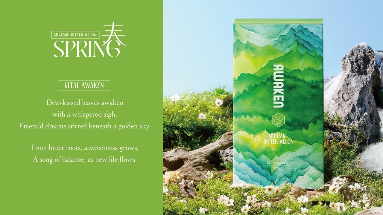
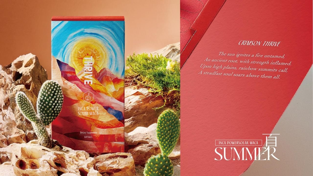
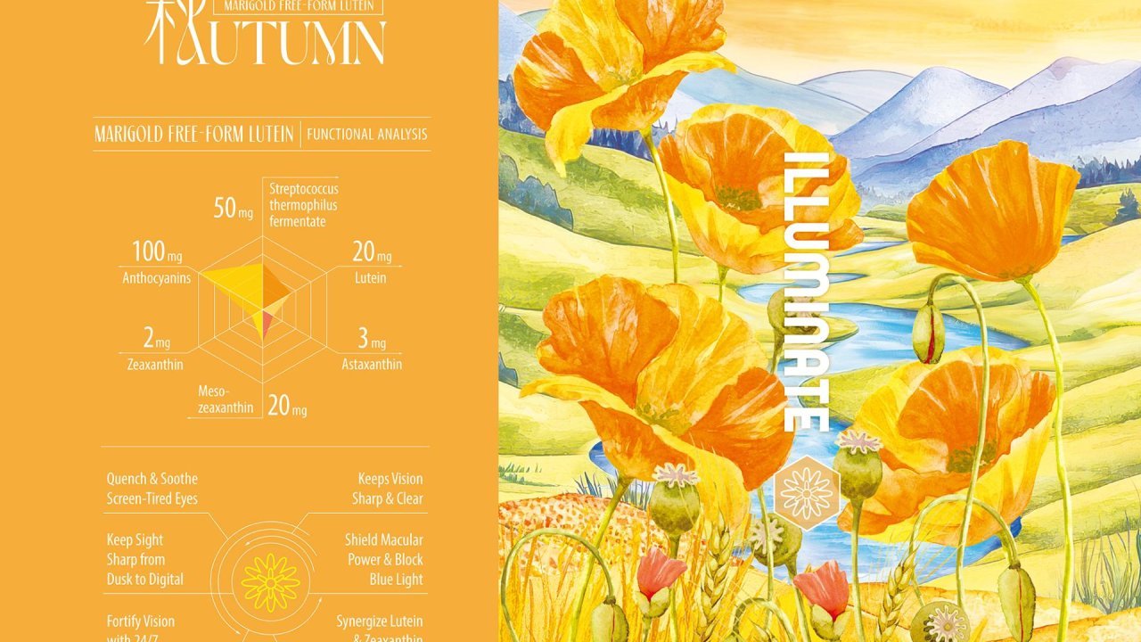
In the “SEASONAL RESONANCE” series created for MAH, we treat design as an art of translation—transforming nature’s silent poetry and our technical expertise into tangible, perceptible, and collectable life experiences. By choosing “the Four Seasons” as the core design concept, we wanted to convey that health is a 365-day continuous journey. Our aspiration is to be the guardian of well-being through every important stage of consumers’ lives.
France has always been a global benchmark for aesthetics and artistry. Receiving the Silver Award at the French Design Awards is therefore deeply meaningful to us. MCB, as a CDMO company in the nutrition and health industry, being recognised on such an international design stage marks a groundbreaking achievement.
This honour is not only an international recognition of our design philosophy, but also powerful proof that nutrition and health products can be seamlessly integrated with art and aesthetics.
It demonstrates that the origin stories and intrinsic value can be delivered through packaging design in the market. This award is not only a tribute to our team’s dedication, but also a clear message to the entire health industry: an extraordinary brand experience can—and should—be built from the very first stage of production.
Winning this prestigious award has created ripple effects across our company and beyond. For our design department, it has been a powerful affirmation that even as a raw ingredient manufacturer, design can play a vital role in shaping brand value. Internally, the award has sparked stronger creative synergy, bringing our R&D, Design, and Marketing teams closer together in ways we had never experienced before.
Externally, it has elevated Ming Chyi Biotechnology’s credibility on the global stage, opening up new opportunities for collaboration with international partners who now see us not only as an ingredient supplier but also as an innovator in design and branding.
Experimentation drives breakthrough innovation. We've launched a sensory revolution across three dimensions. First, through Tactile Terrain, we used textured surfaces that invite people to ‘feel the seasons’ with their fingertips. Second, with Colour Psychology, we translated natural colours into quick, intuitive responses—green for renewal, red for vitality, gold for abundance, blue for purity.
Finally, our Unboxing Experience balances logic and emotion: one side presents scientific data while the other shares seasonal poetry. Together, these experiments redefine how consumers connect with supplements, making it both meaningful and memorable.
During our research for the spring product line, we discovered a remarkable correlation between the surface texture of bitter melon and mountainous terrain. This serendipitous observation immediately illuminated our design direction. We shifted our approach from "designing" nature to "translating" its inherent qualities.
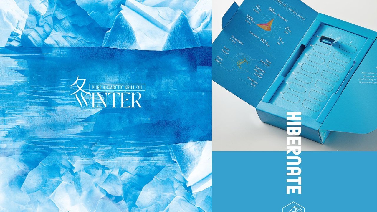
Each ingredient revealed its own topographical code: bitter melon's textured surface corresponds to spring mountains, maca's coarse texture reflects highland plateaus, marigold's lustrous quality captures autumn fields, and krill oil's crystalline clarity embodies winter seas.
These microscopic textures have been transformed into comprehensive visual and tactile language, giving each season its distinctive "signature pattern” and turning the natural connection between ingredients and their origins into tangible, poetic experiences.
At Ming Chyi (MCB), balancing client expectations with our own ideas is unique because we are both the creators and the clients. As an ingredient manufacturer, we approach every project from two perspectives: the scientist, who ensures data accuracy and scientific integrity; and the brand storyteller, who translates those ingredients into meaningful experiences.
Our design philosophy is about integration rather than compromise—scientific rigour provides the framework, while creative expression brings the ingredients’ stories to life. This synergy is what allows ‘SEASONAL RESONANCE’ to emerge, connecting consumers not just to a product, but to the origin, quality, and narrative of each ingredient.
The main challenge was stepping beyond our usual scientific mindset and embracing artistic elements. As a science-focused solution provider, some of our team were initially sceptical about incorporating poetry, colour psychology, or tactile textures—wondering if consumers really needed such artistic approaches in nutraceutical products.
We overcame this by holding intensive cross-departmental workshops, bringing designers and researchers together to connect rational and emotional perspectives. The Silver Award validated our approach, showing that when products carry a sense of soul, they can resonate with the market in ways we never expected.
“Empathy” is at the heart of everything we design at Ming Chyi (MCB). Observing our families, we saw that taking supplements often felt like a cold, mechanical task rather than an enjoyable act of self-care. This inspired our mission: to turn a daily health routine into a warm, sensory-rich ritual.
Every design decision reflects this—therapeutic textures and colour psychology on the packaging, scientific data paired with poetry, and intuitive tracking functionality to make daily intake effortless.
Our goal is to create more than effective products; we aim to craft meaningful two-minute rituals that nourish both body and mind, connecting consumers to the origin, quality, and story of each ingredient.
Designers are not merely visual creators. We must comprehend clients' business models and investigate the core technologies behind their products. When you successfully translate this complex information into clear, emotional narratives, you transform not only packaging but the entire brand experience.
Cold data becomes warm stories, products evolve into belief systems, and every design decision becomes a brand asset that drives both trust and commercial growth. Great design is not just seen—it’s felt, experienced, and remembered.
We would select Katsushika Hokusai (葛飾北齋), the master"translator of nature". He never merely replicated what he observed; rather, he distilled the essence of nature. Historical accounts indicate that he spent three years observing eagles to perfect a single illustration. He reportedly spent countless hours by the seaside, meticulously studying wave dynamics.
This extraordinary attention to detail and relentless pursuit of perfection exemplifies our product development philosophy: each ingredient formulation undergoes hundreds of iterations, and every design element is meticulously refined.
Ultimately, in his masterpiece "The Great Wave off Kanagawa" (神奈川沖浪裏), the waves transcend realistic water representation to embody pure force itself. Mount Fuji in "Clear Day with a Southern Breeze" (凱風快晴) evolves beyond geographical representation to become a spiritual symbol. This precisely reflects our core values and philosophy.
We hope people would ask: “Why do you emphasise touch, colour, and brain balance as the three pillars of your design?”
Our answer:
We have engineered what we call a sensory persuasion chain. The three elements that form the sensory persuasion chain are:
1. Colour – creates an instant emotional connection within the first 3 seconds (e.g., green for renewal, red for vitality, gold for radiance, blue for purity).
2. Touch – anchors memory through tactile experience; research shows people retain tactile memories up to 70% better than visual ones.
3. Brain Balance – harmonises logic and emotion by engaging both hemispheres: the left page of packaging satisfies logic with data and structure, the right page with poetry and imagery.
Together, these three pillars guide perception, imprint experience, and transform decision-making into affirmation.
Winning Entry
Seasonal Resonance | 2025 French Design Awards
This innovative packaging design project focuses on four health supplements from MING CHYI BIOTECHNOLOGY LTD., aiming to transcend the traditional, cold image often associated with health products. The project seeks to redefine their aesthetic appeal by transforming... (read more here)
Read more design stories and insights through The Living City: Harvard Alum Architect Xinyun Li Shares Her Insights here.


