Building Easel: A Smarter, Friendlier Way to Explore Museums
June 19, 2025
Why Omar Almoteq Asks “Why?” Before Anything Else
June 19, 2025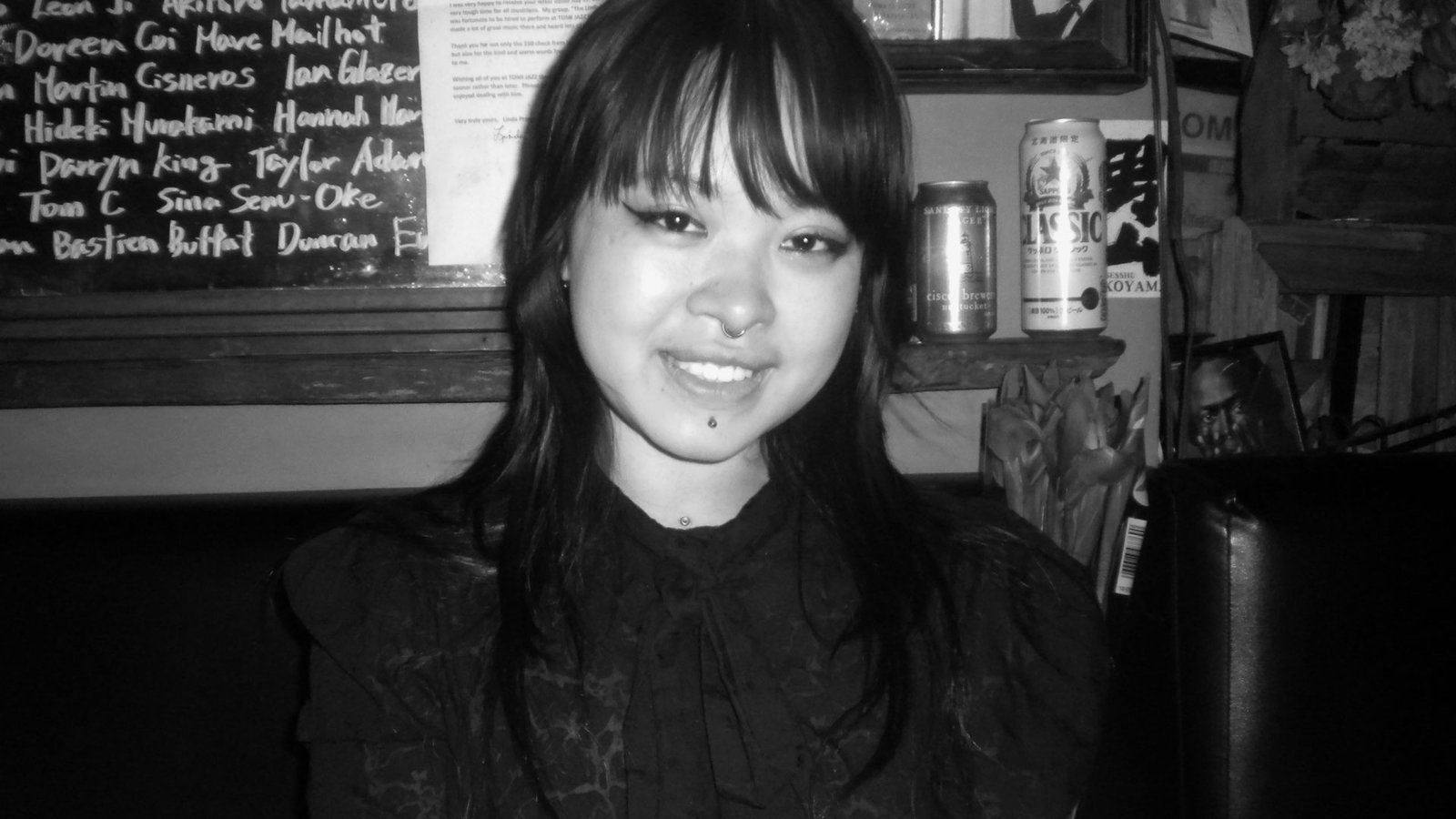
Jie Jian | MUSE Creative Awards
Jie Jian
Jie Jian is an award-winning graphic designer and typographer who explores how language, materiality, and storytelling connect. Her work uses typography to evoke emotion, challenge institutions, and foster connections, with collaborations including the Walker Art Center.
I'm Jie Jian, an award-winning graphic designer and typographer exploring the intersection of language, materiality, and storytelling. My work examines how typography evokes emotional responses, challenges institutional spaces, and fosters connections. I've collaborated with institutions like the Walker Art Center and developed projects that reimagine our experience of text.
My design journey began with a deep fascination for language as a visual medium. I have always been drawn to how words exist beyond their meaning—how they take shape, move through space, and interact with various materials. This curiosity led me to explore typography beyond its traditional role, experimenting with print, digital, and tactile formats to expand the boundaries of how design can convey meaning.
I submitted because both projects explore the role of typography in storytelling and human connection, which I consider fundamental to contemporary design. Among Friends rethinks how museums engage with visitors, while another serves as an intimate experiment in using typography as a tool for self-expression and emotion.
Design shapes our interaction with the world; it influences how stories are told, how institutions communicate, and how individuals perceive themselves. Both projects address urgent themes: institutional accessibility, self-representation, and the emotional weight of language. Typography, a fundamental component of public communication, can either reinforce traditional narratives or challenge them. I see my work as a way to push beyond function into deeper, more meaningful interactions—creating moments of intimacy, provoking thought, and amplifying voices that might otherwise go unheard.
Winning at the MUSE Creative Awards affirms the impact and relevance of my work within the design community. It reinforces my commitment to using typography as a powerful tool for storytelling and social engagement. As someone who has long been involved in exhibition design, publication, and experimental typography, this recognition validates my approach and contributes to the ongoing discourse on the emotional and institutional roles of design. More than just an accolade, it underscores the importance of pushing the boundaries of typography to foster deeper connections and challenge conventional narratives.
Both projects began with questions rather than answers. With Sinful Magical Girls, I was grappling with conflicting feelings around shame, girlhood, and self-expression, and I wanted to find a form that could hold that tension without resolving it. The concept of using typographic behavior (disappearing, distorting, or resisting readability) came from realizing that type could act as both voice and emotion.
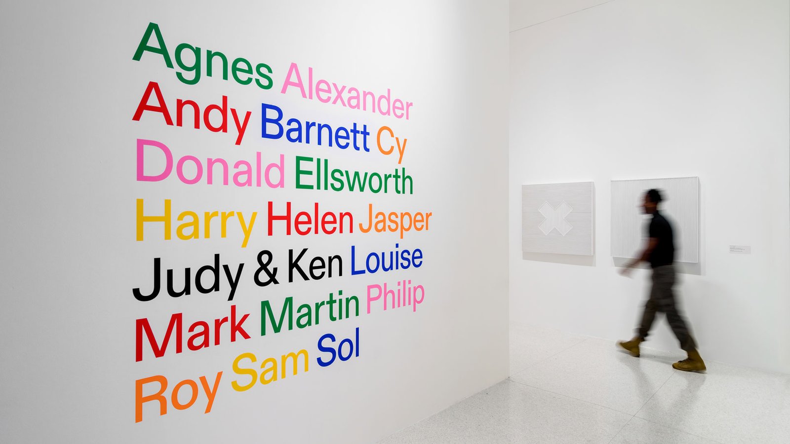
Among Friends was rooted in a desire to soften institutional design. I was inspired by the warmth of casual conversations and wanted to bring that energy into the museum space, creating text that felt more like a whisper than a plaque.
In an industry that often favors clarity, polish, and uniformity, I think these projects stand out by embracing ambiguity and emotional depth. They show that design can hold space for vulnerability and still be powerful.
Both projects stand out because they challenge how typography functions—one in a museum setting and the other as a deeply personal and tactile experience.
For Among Friends, I viewed typography as an extension of personal relationships rather than merely a design element. Instead of utilizing conventional museum label placements, I adopted a more human, conversational approach—subtly shifting how visitors engaged with the exhibition. The text felt less like an authoritative guide and more like an invitation to connect. This method speaks to more significant questions in design regarding institutional accessibility—how can museums feel more personal and more welcoming?
The difference with my other second project stemmed from how I approached typography—as a means of readability and as a visual language for emotion. The text does not just tell a story; it acts in a manner that reflects its meaning, fading, shifting, or becoming unreadable at moments of vulnerability.
Both projects take risks in how text is felt and experienced rather than just how it appears, and I believe that's what made them stand out.
For Among Friends, the biggest challenge was navigating institutional constraints. Museums have a structured way of presenting information, and my approach—introducing more warmth and informality—was unconventional. Concerns arose about clarity and readability, so I had to discover a way to balance pushing creative boundaries while respecting institutional needs. Through collaboration with curators and extensive testing, I preserved the project's emotional depth while meeting exhibition.
The challenge was to make deeply personal experiences feel universal. The project was rooted in my emotions, but I wanted to avoid making it feel isolating. The turning point came when I allowed typography to convey the emotions—distorted, disappearing, or unstable text that visually reflected the complexities of identity and self-perception. This shift enabled the project to resonate beyond my own experiences.
Both projects reinforced the idea that design is a negotiation between meaning and form, personal and public, structure and spontaneity.
This recognition reinforces my ongoing commitment to pushing the boundaries of experimental typography, exhibition design, and storytelling through text. Awards like the MUSE Creative Awards don’t just celebrate achievements; they open doors to meaningful collaborations, new projects, and critical discussions with others who are redefining the role of typography in contemporary design.
Typography is not just a tool for communication—it shapes how individuals engage with language, space, and memory. This award highlights the power of typography to challenge conventions, enhance visibility, and create deeper emotional connections. Whether in public spaces, publications, or installations, I am dedicated to continuing this work and expanding the dialogue on how design fosters empathy and engagement.
Since receiving this recognition, I have already seen increased interest from galleries and institutions eager to explore typography in new and unconventional ways. It is rewarding to witness how deeply personal projects can resonate beyond my own experiences, reinforcing the broader impact of my approach to design.
While these projects were shaped by the communities and collaborators who influenced them, they ultimately reflect my vision and commitment to typography as a tool for storytelling and connection.
Among Friends wouldn’t have been possible without the team at Walker Art Center, whose trust and support allowed me to challenge how text operates in institutional spaces. Their openness to my ideas played a key role in bringing this project to life.
Sinful Magical Girls was deeply personal, and I’m grateful to the friends who shared their stories with me. Their experiences added richness to the work, but it was my responsibility to craft a design that honored those narratives in a meaningful way.
Design is about connection, and this recognition reaffirms my belief that typography can be a powerful bridge between personal expression and collective experience.
One of my recent projects, Touch, explored how language and typography can reflect experiences of intimacy, consent, and bodily memory. I’m continuing that line of inquiry through new typographic works that investigate communication across digital and physical spaces.
At the same time, I’ve been dedicating more time to ETA Gallery, a Brooklyn-based pop-up space I co-founded to support underrepresented artists. We're currently working on upcoming exhibitions, thinking about how space, text, and community all inform each other.
Whether through publication, installation, or collaborative shows, I’m excited to keep expanding what typography can hold.
Winning Entry
Among Friends | 2025 MUSE Creative Awards
Jie Jian
Jie Jian is an award-winning graphic designer and typographer who explores how language, materiality, and storytelling connect. Her work uses typography to evoke emotion, challenge institutions, and foster connections, with collaborations including the Walker Art Center.
Explore the journey of Easel Team, the Gold Winners of the 2025 MUSE Creative Awards. Easel, created by Nanwei Cai, Xinyi Ye, Chuoer Liang, Jiaxi Yang, and Chenxi Liu, is an AI-powered museum app that transforms visits with personalized tours, immersive AR, and a chatbot that makes art come alive.


